

Background: Formed in 1911, the Austin Symphony Orchestra is the oldest performing arts group in Austin. They offer complete seasons of musical and educational programming that continue to better enhance the cultural quality of life for the adults and young people of the community.
My Roles: user research, visual design, wireframes, competitive/comparative analysis, client interviews, heuristic analysis, personas, user flows/journeys
Team: Matt Toman & Eunice Cook for General Assembly
Tools Used:


Photo of: Current Austin Symphony Orchestra mobile app
Competitive/Comparative Analysis
After first reviewing the pertinent details about the symphony, I tried to get as much information about their competitors. I found out that their main competitors weren't exactly other orchestras, but rather museums, theaters, operas and ballets. I tried to identify particular strengths of different competitors out there. I was especially drawn to the layout and features of the Boston Pops mobile app. On the flip side, using popular comparative sites like Amazon, Airbnb and Humans of New York (to name a few) provided immediate inspiration.

Competitor: Boston Pops
Strengths: ability to have large visual elements, cards/titles, efficient filter options, ability to join the conversation and become engaged
User Flows

Purchasing tickets through ASO can be daunting with unnecessary steps. Conversely, Ticketmaster & Stub Hub showcase strengths based on a quick, efficient checkout.
Market Research
When trying to research our target audience, I spent some time uncovering data about Millennials. Looking through this information, it seemed to be quite clear that a mobile app was the solution. Here's some data that supports our decision:
Almost half of Millennials downloaded a shopping app on their phone
54% like these types of apps because the experience is better than mobile sites
27% shop using apps to take advantage of exclusive offers and discounts

U.S. Smartphone Market Share For Age & Operating System (Source: Nielson, 2014)
Interviews & Surveys
To get a better sense of what our target audience, we needed to talk to people that could help us identify pain points, as well as the reasons people are drawn toward the symphony. This helped emphasize previous thoughts while simultaneously shifting thoughts into a new direction. My partner and I reached out to several different people at ASO and created a survey for members, each helping us gain new insight through every interaction.
“…it’s about friends getting together. It’s an opportunity for young professionals that appreciate the arts to meet, support the symphony and give back to the arts.”
“the goal of the website is to highlight upcoming events and to have quick links to donations and tickets.”
Summary of feedback: After receiving feedback from our survey and client interviews, we realized the importance of having a community for people to connect.
This is where we shifted our attention towards BATS; a young professional group where a membership provides premier seating and a post-performance happy hour event. When speaking with Evelyn Meditz, a board member with BATS, we pitched the idea of there being a communal element visually and aesthetically akin to the website, Humans of New York. She was familiar with what that site offered and was excited at the prospect.
“Increasing knowledge of BATS and the awesome after parties would be excellent”
“A post show meet-up for ‘young’ concert-goers would be a fun way to build connections and create an audience that comes to every show”
Personas


Brand ambassadors

Diane, our primary persona

Through additional research and further discovery, ideas began to take shape...
While purchasing tickets is the primary goal for the symphony, it seemed to be clear that a stories/community element was going to become a big part of our mission. When we reach the design phase, you'll start to see the ideas from previous research making its way into the process.

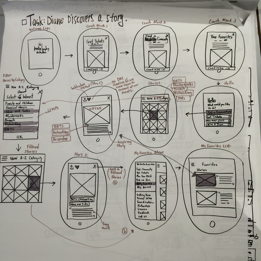
Design Flows & Testing
When it came time to design, working on a large sketch pad was significant to the completion of the project. This was a collaborative effort where we could both clearly see what was happening and continue to iterate and take notes while continuing to push through with lo-fi to hi-fi examples. After numerous sketches, we began to conduct user tests to refine and enhance what we had.


Primary pain points from user testing:
• Unclear wording
• Unsure where next would take me
• Unsure if certain things were clickable
Key Wireframes
Creating the wireframes helped a lot of unanswered questions come to the forefront. Taking in the notes that we received, my partner and I each did a particular flow in Sketch. My tasks were to primarily cover the purchasing of tickets, but spilled over into other crucial wireframes, too. I believe that I also had valuable advice in effectively choosing the correct wording that would convey the task at hand.

Introduction: Coach mark elements to begin the experience of the app. Immerses the user from the get-go.

Read our stories: 1) Clearly stated actions, 2) cards/tiles aid in visualizing the experience, 3) story pages create engagement and interaction
Credit: Euni Cook

Purchase Tickets: 1) Large visuals, abundant information/tags, options to like, provides options with purchasing tickets, 2) Intuitive section map that allows one to choose by pressing an area, 3) Intuitive seat map that gives you options, but isn't bloated.
We knew that donation processes would be important to our project because it has been clearly stated before that it is. The idea of donating or volunteering is something that’s presented in the checkout process, yet it does little to create a call to action. Illustrating that during checkout is key.
In retrospect...
I believe that this was the most insightful project that I've been apart of, thus far. The working relationship with my partner was one that helped me recognize my strengths and weaknesses while also helping to advance my knowledge of these processes. In a collaborative effort, everyone has a unique perspective on how to do things, but I think that understanding someone else's process helps inform the way you go about a project. Given a chance to repeat this assignment, I would most definitely want to be more on top of documenting each stage of the process. Being able to take note of every action or idea and refer back to it would've been great. That's not to say I didn't take notes (because I definitely did), but next time I'll do that better. One other thing could definitely deal with time management. I think that it's a significant part of any task I may take on, but knowing when to move on to the next thing is crucial to effectively presenting something like this. In the end, I feel that it was a rewarding project that I'm thankful to have experienced.